Making 3D Buttons with Sass
See the Pen bcjyH by Jesse Shawl (@jshawl) on CodePen
I’m a huge fan of the button styles on CSS Tricks, and wanted to create my own.
When I inspected the element, I saw there was a ridiculous amount of box-shadows with alternating hex values:
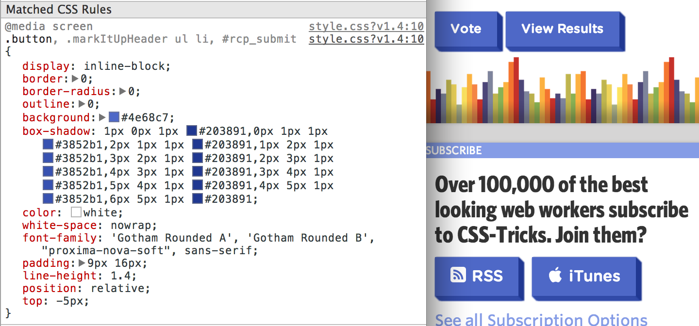
My first attempt of recreating these buttons involved me writing out the box shadows by hand. After about 10 minutes of guesswork and less than desirable results, I knew there had to be a better way.
Looking for a pattern
Since the box shadow values are growing incrementally in a systematic way, we can loop through some arbitrary number with Sass.
.button{
 @for $i from 0 through 10{
    //make some box shadows maybe like:
    box-shadow: $i+px $i+px 0px #bada55;
 }
}
I first thought we could just embed a forloop in a declaration, but doing this will just keep adding box-shadow properties to the rule, overwriting each previous one as we loop through. Additionally, we’ve got no way to handle the alternating colors.
I decided the best way to handle this was to use Sass to build a string of values, such that the desired CSS output was something like:
  box-shadow: 1px 0px color1, /* first arbitrary number */
              0px 1px color2, /* first arbitrary number */
              2px 1px color1, /* second arbitrary number */
              1px 2px color2; /* second arbitrary number */
Ah, yes. A pattern!
What we’re trying to achieve is for each arbitrary number, we want one box shadow 1 pixel visible to the right in one color, and one box shadow 1 pixel visible on the bottom in another color.
That is, for each $i in the loop, we need to do two things:
- Handle the box shadow visible on the right
- Handle the box shadow visible on the bottom
Once we have each of these things, we can build up a string of values and add them to our box-shadow property. In order to build a string, we’ll need a Sass function.
  @function boxShadowString($offset, $color) {
  // this function takes two arguments: an offset (how 3d the button will be)
  // and a color: we'll use Sass to darken the color to get alternating
  // box shadow colors.

  // create an empty variable: this will be the string to which we
  // append our box-shadow values
  $box-shadow:();

  //loop through however many numbers ($offset)
  @for $i from 0 through $offset{

    // create the value for the box-shadow visible to the right
    $first: $i+1+px $i+px 0px darken($color, 15%);

    // create the value for the box-shadow visible to the bottom
    $second: $i+px $i+1+px 0px darken($color, 18%);

    // add the box shadow visible to the right string to our $box-shadow variable
    $box-shadow: append($box-shadow, $first, comma);

    // add the box shadow visible to the bottom string to our $box-shadow variable
    $box-shadow: append($box-shadow, $second, comma);
  }
  // return the string of all of these values
  @return $box-shadow;
}
Note: the append method in sass takes two arguments, and an optional third.
They are: append(THING_APPENDED_TO, THING_APPENDING, SEPARATOR). We’re using ‘comma’ as the third argument to get a comma separated list of each of these box-shadow values. You can read more about the append() method here http://sass-lang.com/docs/yardoc/Sass/Script/Functions.html#append-instance_method.
3d-ifiyng the button
Now, we can add this function to our button:
.button{
  box-shadow:boxShadowString(10, #bada55);
}
It looks super 3D, but there’s no interactivity. Let’s add a hover state that moves the button up and to the left 2 pixels, and makes the box shadow 2 pixels longer.
.button{
  box-shadow:boxShadowString(10, #bada55);
  &:hover{
    transform:translate(-2px, -2px); /* move the button up and to the left */
    box-shadow:boxShadowString(12, #bada55); /* make the box shadow 2px longer */
  }
}
And finally, we can add an :active state to change the button style on click.
.button{
  box-shadow:boxShadowString(10, #bada55);
  &:hover{
    transform:translate(-2px, -2px); /* move the button up and to the left */
    box-shadow:boxShadowString(12, #bada55); /* make the box shadow 2px longer */
  }
  &:active{
    transform:translate(9px, 9px); /* move the button all the way down, except for a 1 pixel offset */
    box-shadow:boxShadowString(1, #bada55);
  }
}
At the moment this works, but there’s a huge amount of repeated and tightly coupled code here. The box-shadow in the :hover state should just be 2px greater than whatever the $offset is and the :active state’s transform property should be the $offset minus 1 pixel.
I know! We can use a mixin!
  @mixin threeDify($offset, $color){
    /*do some base stuff*/
    box-shadow:boxShadowString($offset, $color);
    &:hover{
      box-shadow:boxShadowString($offset+2, $color);
      transform:translate(-2px,-2px);
    }
    &:active{
      box-shadow:boxShadowString(1, $color);
      transform:translate($offset - 1+px, $offset - 1+px);
    }
  }
And finally, we can make our button super 3D by @include‘ing the mixin:
  .button{
    background:#bada55;
    @include threeDify(10, #bada55);
  }
See the Pen bcjyH by Jesse Shawl (@jshawl) on CodePen
Edit this Post